De Landsheer Brewery
→ My Taste of Happiness.
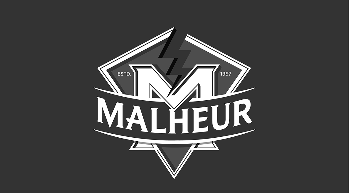
When the De Landtsheer Brewery in Belgium first launched its range of Blond, Triple and Brown beers in 1997 I was working for a well respected design agency in Brussels, Marketing Design, and as a youthfull middleweight designer created the original Malheur brand and its respective packaging.
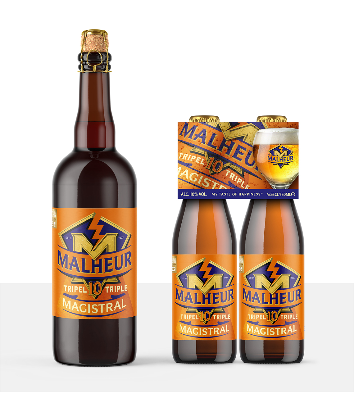
The Malheur name when spoken amongst Belgian natives means ‘little kick’ or mishap which led to a literal crack becoming part of the visual brand language; a playful element full of attitude that when combined with a design rooted in tradition was the perfect quirky blend for its 18-35 year old audience.
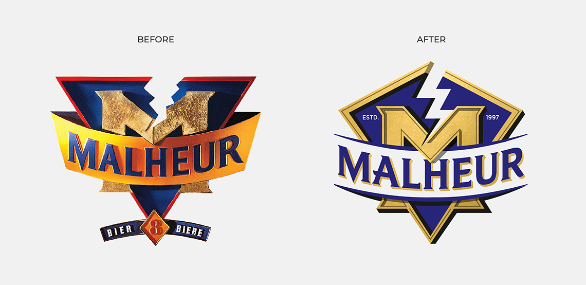
The original intention was for the mark to applied as a 2D graphic across the breweries new product range and marketing materials. Unfortunately our partners, Moors Bronslauer Advertising Agency, felt the design would better be represented using photography and manifested as a physical 3D asset which I was never really happy with. So I was delighted some 28 years later to get a call from my former MD in Marketing Design with the vision to reimagine the brand for the 21st Century.

Strategy
The Malheur brand had seen some decline over the years with more competitors and youth orienteered craft beers entering the market. The decline was also reflected in the simple fact that more consumers were bringing beer into the home and less people were going to bars unless for an event or special occasion.
De Landsheer is a small independant brewery without the spending capabilities of some of its competitors. This meant the strategic approach had to work hard on many levels for its existing audience with the goal to gain new consumers for their high quality beers.
I conducted a brand audit and looked in detail at what competitors were doing differently. Who was excelling in their field through positioning, marketing and design?. What insights could we take from current market trends and how could we turn decline into growth? Where where the unseen opportunities?.
Working alongside Qurious (formerly Markeing Design) we analyised our findings and were able to develop a clear marketing and design strategy for moving the brand forward in all communications.
Solution
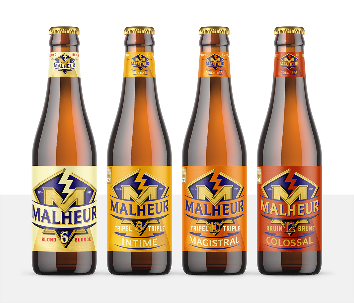
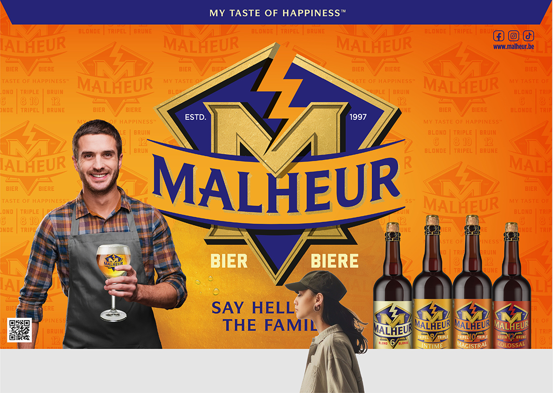
We focussed on the shared experiences of consumers and repositioned Malheur as the go-to premium offering for home consumption and special occasions. The beers themselves are of the highest quality which was seriously lacking in the pre-existing representation of the brand. The goal was to create a luxury brand that people would be proud to have in their basket or local bar— an aspirational lifestyle brand which was reflected through the tagline ‘My Taste of Happiness.”
The task was to evolve, simplify, modernise and premiumise the brand with a clear focussed repositioning.
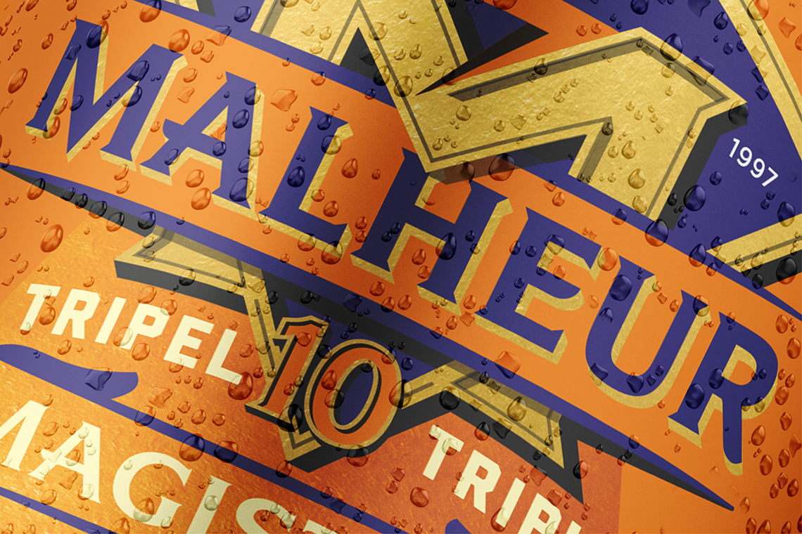
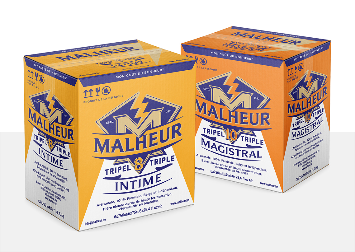
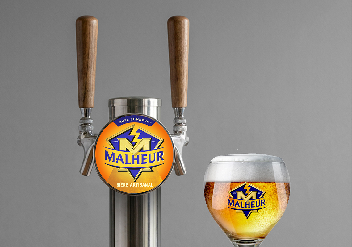
I looked at every detail of the design with the intention to elevate the brand into a premium world-class luxury beer brand. I crafted every aspect ensuring consistency, heirachy, stand out and shelf presence was maintained throughout. I also developed an expanded kit of parts for applying the design across promotions and event graphics. The resulting design was rolled out across packaging, POS, barware, signage, event graphics and sales collateral.
Result
The rebrand was launched in 2026 in Belgium, France and Italy with its first sharing event set up to celebrate the 2026 World Cup.