Matt D'Arcy & Co. Ltd.,
→ A New Era for Irish Whiskey.
In 2018 I was commissioned by The Tenth Man to develop a brand identity, packaging and collateral for Matt D'Arcy & Co. Ltd., who had the vision of reviving their once "World Famous" Irish Whiskey brand. This was to coincide with the development of the original distillery on Monaghan Street in Newry into a visitor destination and working distillery.


Strategy
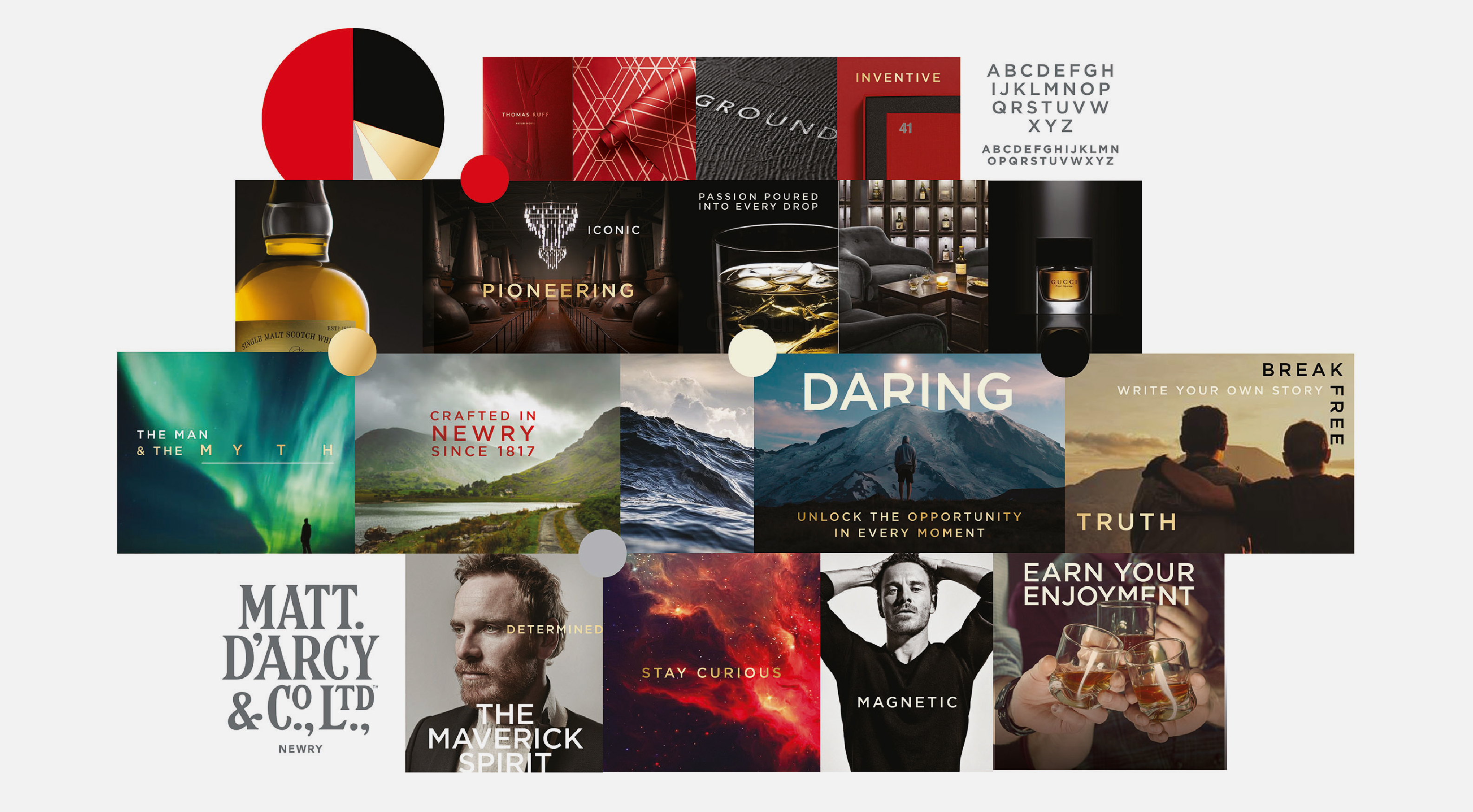
Working alongside The Tenth Man I set about exploring the latent history of the brand to unlock the story of its founder Matt D'Arcy, who first established the distillery in 1817. Matt D’Arcy, the man, was an entrepreneur, philanthropist and community leader and we looked to imbue the brand with his spirit – pioneering, daring and iconic.
At the time, Ireland's whiskey market was going through a period of increasing growth which created its own set of challenges when looking to resonate with consumers and to create stories of real authenticity. However, we were gifted with Matt's legacy and a rich visual history that we could harness and build upon alongside our core truths – that this brand comes from a place rooted in tangible history.
With our sights set on becoming a challenger brand to premium Irish whiskeys; we focused our approach on the creation of a fully formed, ready for market, 'authentic' Irish whiskey brand.
Solution
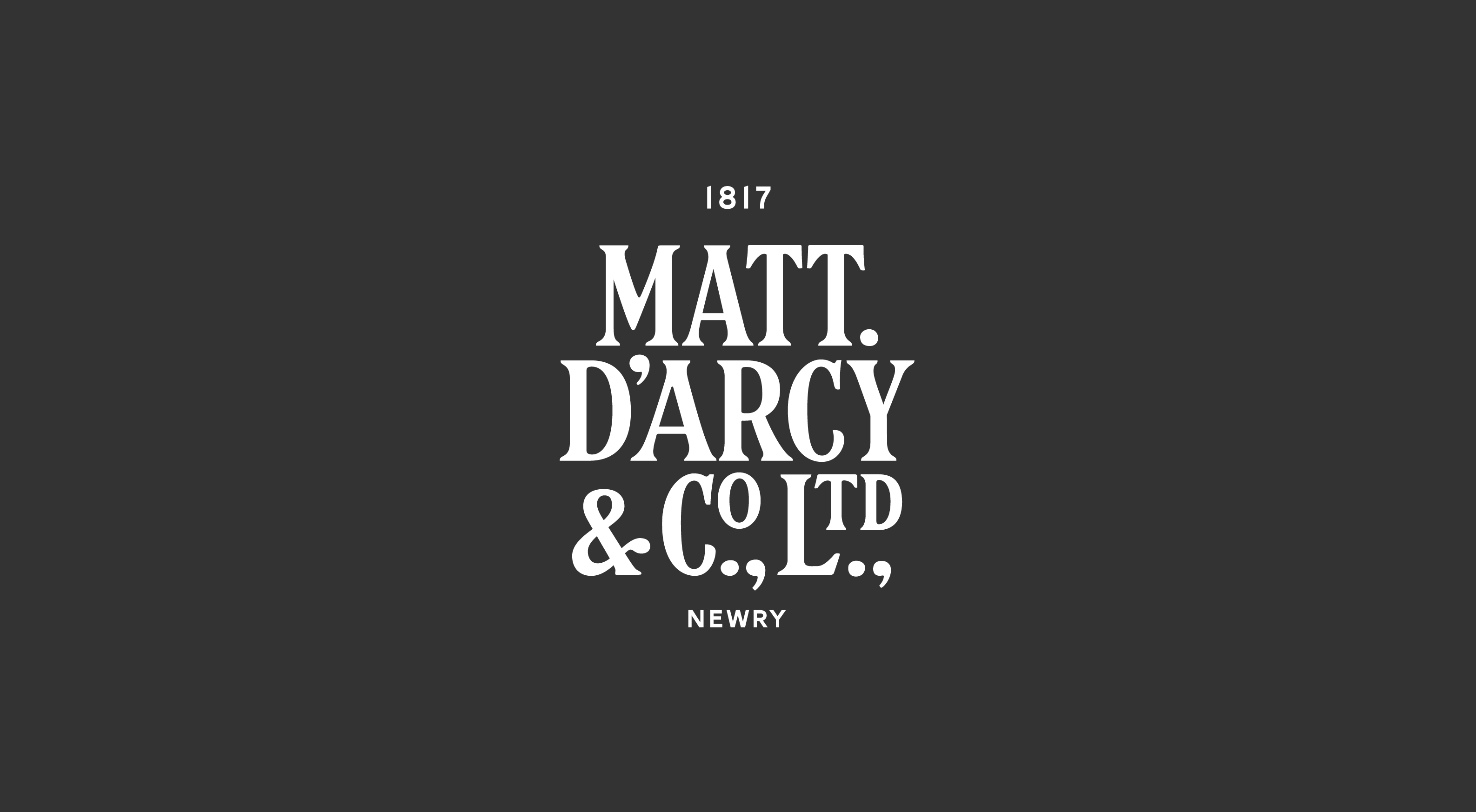
During the process of understanding more about Matt D'Arcy's story, the distillery, and its importance to the merchant city of Newry; I discovered the original archival logotype, which we assumed, just by its nature, was designed by the hand of the engraver of the original printed plate.
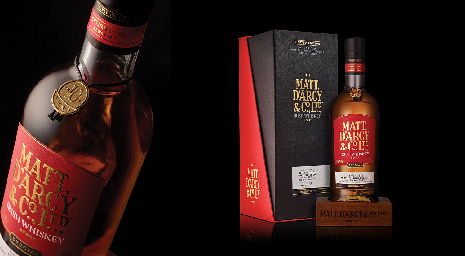
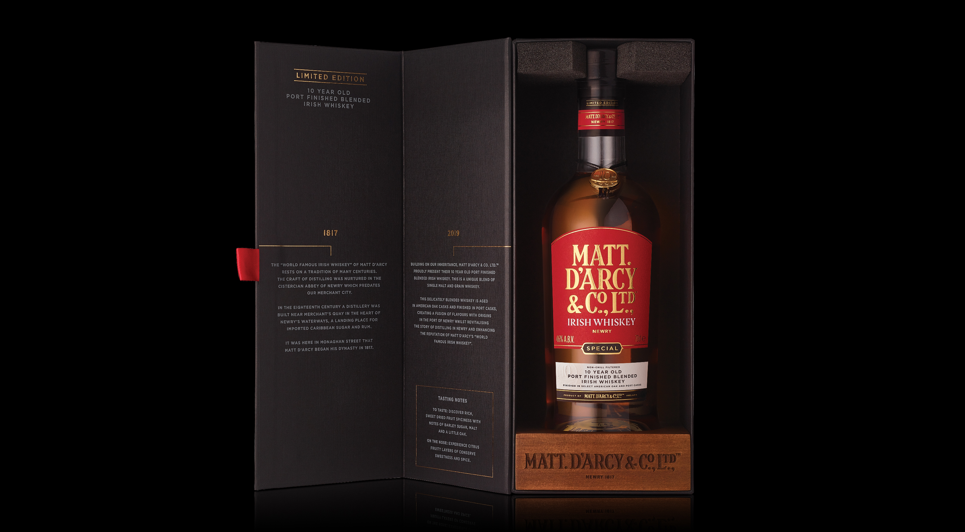
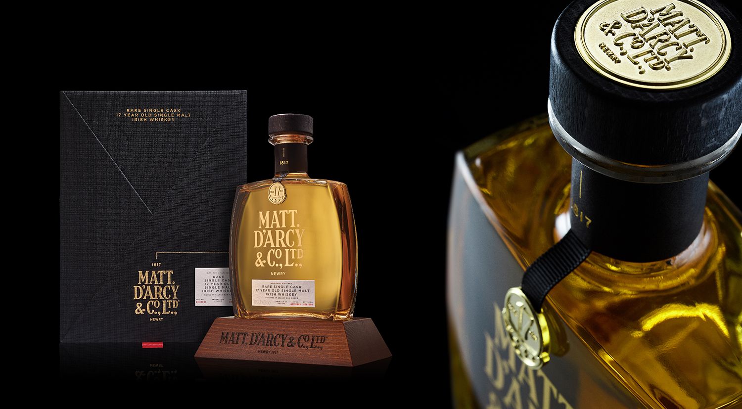
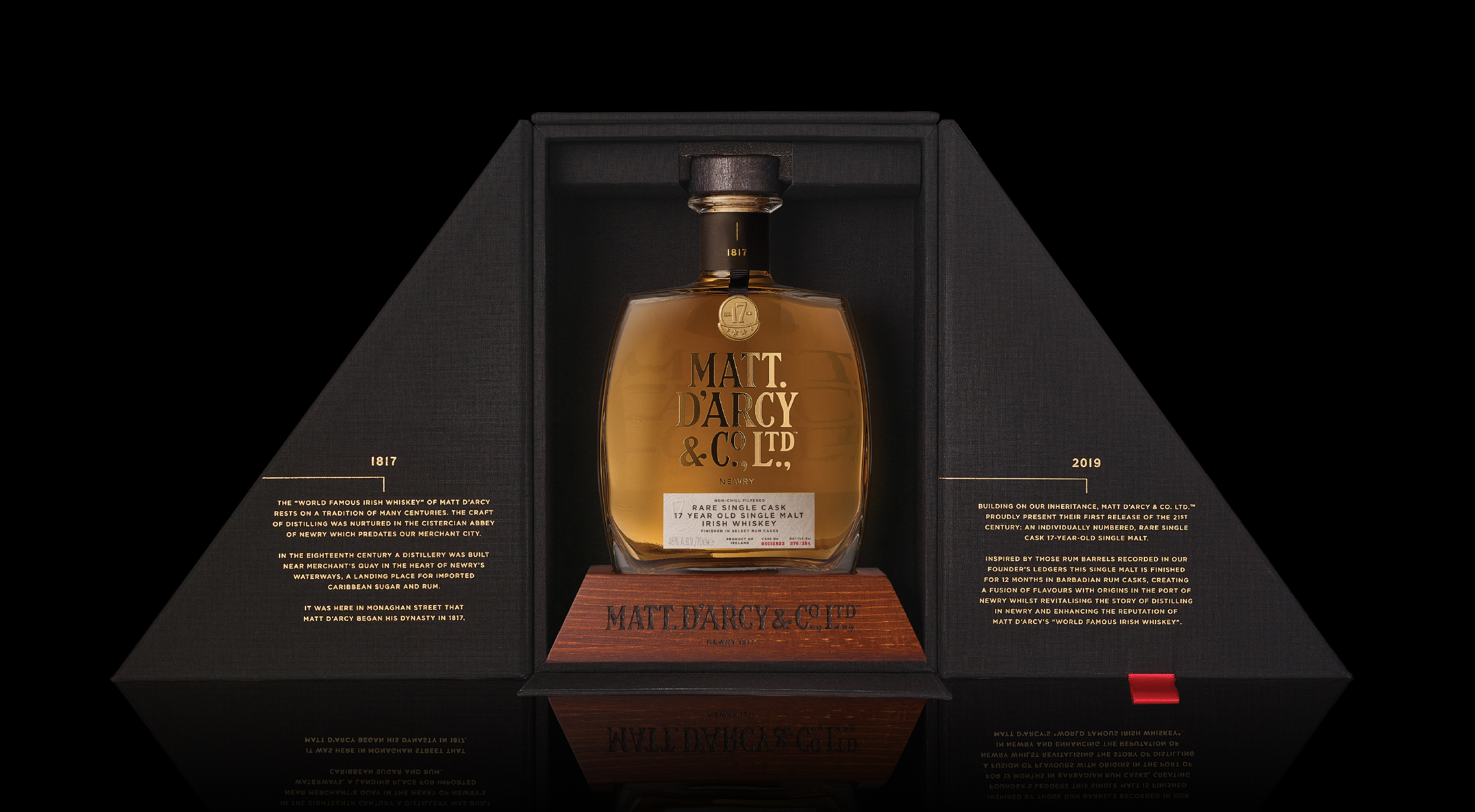
I redrew the original logotype, updating it for the 21st century, while keeping its idiosyncracies intact, and placed this front and centre to hero the brand. This was fine tuned by the typographer Anthony Milliard. This confident approach gave us license to offset the old against the new with the introduction of contemporary pack forms and finishes.
The iconic pack forms create outstanding shelf presence as family tree styled stories guide you through each design. Bespoke coin and medallion details highlight the age and provenance of each individual whiskey, offset with contemporary typography and embossed, textural label detailing. The bottles housed in walnut plinths further enhance the brand and the gold details dial up the luxurious aspect of this premium family of whiskeys.
Results
Launched in late December 2019, the first releases in over 100 years were crafted to create maximum impact with minimalistic design touches in what was quickly becoming a visually cluttered and saturated market.
Since its launch annual turnover reached 3.3 million with high growth over the years that followed. This was noticed by The Echlinville Distillery in Belfast who now have ownership of the Matt D’Arcy & Co. Ltd., brand as part of their extensive whiskey portfolio.